Gothamite
Well-Known Member
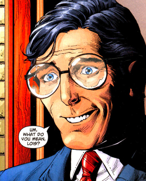
I have really mixed feelings about Gary Frank's work on the various Superman titles. I'm reading the 'Brainiac' story for the first time now, and I'm loving the look of it. Superman obviously looks like Christopher Reeve and it's great seeing the rest of the Daily Planet for once (we rarely ever get to see them in comic books, anymore). Also, Brainiac looks superbly creepy.
On the other hand though, I read his recent Legion of Superheroes arc a while back and it wasn't up to par at all. Superman looked like Reeve, but the rest of the characters just looked shaky, messy and as if he hadn't really put much thought into their facial designs.
Secret Origins is sort of in between the two in terms of quality, for me. Unlike the previous two titles, it's the design of Clark that drags it down. Not only is the ambiguous age of the character a problem, but so is the general creepiness of Frank trying to make him look like what he imagined Christopher Reeve looked like, as a boy. The rest of the characters are better than before (Lex Luthor, especially) and the environments are all quite great.
What does anyone else think?